Monday, June 28, 2021

Final Altenew Educator Certification Program (AECP) Assignment

Hello All! 

I hope this post finds you healthy, happy, safe, and of course crafting!  In today's post I am sharing my level three final project for my Altenew Educator Certification Program (AECP).  This took me  taken a lot longer that I expected, but you know life…   For my final project, I decided to make a card box.  The challenge to myself was to incorporate an Altenew stamp set with my card box.   I recently purchased Altenew’s Wild and Free stamp set, love, love, love it.   In my level three classes one of the inspiration projects used this stamp set.   It is such a fun and whimsical stamp set.   I love the open lines for colouring or just leaving as outlined image.   This stamp set was simply perfect for my project.   I hope you enjoy it as much I do. 

Making the BoxInstead of make the traditional cardstock box or buying a box from the craft store.  I made my box from scratch using my Laser Printer.   Last year I purchased a Glowforge Pro (GF) but never really did anything with it.  Just recently I started devoting more time to learning how to use it.    For this project I used some 1/8" Maple Wood (12” x 20” sheet), Adobe Illustrator (AI) and a box creating application.  I was able to create my box and engrave some of the images from the Wild and Free stamp set on my box.   

For the AI part: I designed my box template in the Box Design application to be 5” x 7” with a 2” depth and saved the design as a PDF file.    For the stamped images, I stamped the images with Altenew’s Obsidian Black Pigment Ink on to some white cardstock.  I left the images uncoloured.   Once the images were completely dried (pigment takes a little longer than dye ink to dry), I scanned the image into my computer and saved the image as an SVG file.  


I opened both the box template and the stamped image in AI.  I sized and positioned the image on the box sides panels.   The size of your image will depend on how large your box will be.    After I sized my image on the box, I added the “Just A Note” using a font in my computer font library.   To be able to print (engrave) text in the Glowforge (because I did not purchase their premium program at $50/month-NOT!) I had to change my text to a path outline.   I changed my text to an outline, grouped the text, the image, the box panels, and saved it in AI and as an SVG file.   I saved the project in AI just in case I need to make some changes or adjustments.      

Now we are ready to print (engrave and cut)I opened the SVG file up in the Glowforge application.  I used Glowforge proof grade materials, so I did not have to put in any unknown material settings.  If you use materials that they (Glowforge) have tested, the setting for that material is preset and guaranteed to perform as expected.  If I did not use proof grade material, I would have to tell the Glowforge what type of material I'm using, how fast to cut, how much power to use, how many lines per inch to print, and how many times to perform the task.  The wood is covered with masking paper to avoid or sometimes it just decreases the scorch marks from the Laser.  Below you can see the Glowforge engraving the one of the box panels, the template engraved and cut (or so I thought...lol).  You can see the scorch marks on the finish engraving and cutting.  Unfortunately, there was some "OPERATOR ERROR" on this one.  You can see the GF looked like it was cutting out the box template; however, it did not.  I for some reason had changed the settings (still scratching my head on that one...lol).  So, yep, I had to do the whole thing all over (bummer).  After the box is engraved and cut, I removed the masking paper. As you can see, the masking paper was scotched not the finished wood.  This one came out okay, I'm pretty pleased with it.  I put the box together with some strong wood glue, clamped some places to hold the pressure, and and let it sit overnight until the glue dried.  


The pieces should just fall out but they did not, so I had to re-engrave and re-cut the project (sad face).

Note: You may notice the images look like they are white.  The colour is actually the masking tape.  It looked so nice and made the flowers and butterfly standout so well, I decided not to weed those pieces out.  I was going to attempt to colour them the same colours as the butterfly on the cards, but I didn’t want to mess the box up and have to start over again.

The cards:  I really loved the butterfly in the Wild andFree stamp set.  I used the butterfly with some of the sentiments from the stamp set to make a couple of note cards.   My note cards are standard A2 or 4 ¼”x 5 ½”.  I coloured the butterflies using Faber Castell Pencils, Gamsol, and a blending stump.  On the purple butterfly I just added some dots with a black pen.   For the Bluish-Green Butterfly I used some Altenew Sea Sure enamel dots in various sizes.   I added some Wink-of-Stella on both the butterflies to give a little bit of shimmer.   Note: I used small embellishments that I know would go through the U.S. Post Office Pitney Bowles machine for metering.


The envelopes:  I used my We R Memory Keepers Envelope Punch Board to make four envelopes.  I love white cards, so I created coordinating white envelopes for each card.  I tied them together by stamping the butterfly again and the large graphic text from the stamp set on the bottom left corners.   I used the bottom left corner so there is plenty of room for the standard "to" and "from" information, as well as the postage area.   For a different option I created plain colour matching envelopes.  

Here are some photos of the complete project:


Well party people this is my stop with the Altenew Educator Certification Program, but certainly not with using their amazing products.   I highly recommend the AECP if you can.  It is a good experience, and you will take away some valuable information to help you through out your craft journey.   Even if you don’t intend to teach, the classes are really good quality and highly informative.  

Til’ next time, Joyce


Monday, April 12, 2021

Cards in Motion


Hello and welcome back to my blog.  Today, I am going to share all five of my Altenew Educator Certification Program (AECP) level III cards and project.  I believe this is the last part before the certification (but I’m not for certain).   I am going to share them in five (5) different post, so if you are not busy get comfy and let’s get-it-in!  Level III is more relaxed in that you get to pick the classes you want to try as long as they are not classes that you have taken in the previous two (2) levels.  Altenew has a vast library of classes to choose from so you won’t have a problem finding something that piques your interest with great price points too.    I chose the following classes: Cards in Motion, Mixed Media for Memory Keeping, Stunningly Styled Stencils, Muse, and Monoprinting.   They were all a lot of fun and yes, I do recommend all of them.  For now, I left all the cards blank inside. 

My approach to the projects in this level was to go through all the classes first.  I took notes on things that I had forgotten about and tips I found helpful during the class.   After I went through each classes I started on the cards and had the classes up on the computer for reference.    My inspiration for the cards and page was a wide range from the class itself to my K-Pop world.     

The first card I did was for the Cards in Motion class.   There were several examples of cards with motion to choose from which was great.  I really like the shaker with the large window.   I used the Dearest Friend stamp set for my main image.   I like the open lines and the playful feeling of the stamp.  For the sentiment I used the Crafty Greetings stamps set.  The sentiment is stamp with Altenew’s ObsidianBlack Pigment ink.  I love the elegant font mixed with the printed words; the combination of the two fonts really animates your message.  The image is coloured with alcohol markers. 

Please enjoy a few photos of my completed card for the Cards in Motion class from Altenew.  If you are interested in learning more about Altenew products or any of the classes click HERE


Thank you for stopping, stay safe

Joyce

Stunningly Styled Stencils


Alrighty, let’s keep this train rolling! We are checking out card number two (2) from my Altenew Educator Certification Program (AECP) level III class assignments.  This card is for the Stunningly Styled Stencils class.  Don’t you just love the name of the class?!  And these ladies did not disappoint.  I really like stenciling, but I always felt like they were so much work to achieve the beautiful results you often see in project and cards.  I think the problem was I was always rushing to complete the card or whatever I was working on.  Making this card was so enjoyable, which certainly encourages me to use my stencil more often.

I created the background for this card in no time!  A simple design with a bold statement.  My tip is to prepare everything you will need before you begin.  Everything from something to cover your fingers while you ink (to avoid aberrant smudges) to the damp cloth you’ll use to clean the stencil when you’re done.  If you are using a spray adhesive, include that prep as well.  Pre spray (prior to starting the project and while you are gathering the other items) your stencil in a well-ventilated area, so it can have time to be nice and tacky (sticky) when you are ready to use it.  I did this background in 10 minutes max with one attempt.  I am so please with the even distribution of ink across the card, this is thanks in part to Altenew’s Jet Black Crisp Dye Ink pad and their Chevrons Stencil.  I laid down a fairly good amount of ink and even when it dried back the colour did not fade out and lock splotchy.  To help keep my stencil secure, I used a TEMPORARY spray adhesive.  My inspiration for this card was the colours of my own crafting business which are Black, Pink, and White.  I also love the chevron pattern and wanted to make a card using that design.  I wanted a note card feel, so I added the Monogram trimmed in the gold and added a few sequins for the finishing touch.   The colour on the actual card is much darker than what is showing in the photos.  


Joyce

And it’s on to the next…

Monoprinting


Thank you for hanging in there with me.  I hope you are enjoying the cards and that you will find something that may be helpful and or inspiring to you in your crafting journey.   This will be card number three (3) of my Altenew Educator Certification Program (AECP) level III projects.   Card #3 is for the Monoprinting class.  Monoprinting or another name Gel Printing uses as the name is implies Gel like shapes to transfer different media like acrylic paint, dye inks, pigment inks to different sub straits such as tissue paper, vellum, cardstock, etc.  You can use other things such as stamps to take your Monoprinting to the next level.   You can purchase Gel pads on-line (Amazon) or at places like Hobby Lobby, JoAnn’s, or Michaels if you are in the U.S. 

I purchased a set of pads from Amazon last year but never had an opportunity to use them.  I was so excited to see the Monoprinting class in the Altenew crafting class library.   This was my first time doing Monoprinting; although I had seen it done many times on YouTube videos.  I will say it was not as easy as I thought it was going to be.  I did several and I do mean several practice prints before I got to one that I thought might work.  I found that I had difficulty with colour combinations.  A tip that was very helpful was to graduate one colour or you could use the colour combinations by Kristina Werner on Pinterest.  She has put together some amazing colour combinations.  After several what I called failed attempts, I decided to monoprint with a monocolour (lol).   Graduating one colour was a little less anxiety provoking for me.   Something to remember is your print experience is greatly influence by the sub strait and media you use.   Since this was my first attempt and not going as I expected, I kept it simple with dye ink and card stock.   I like the abstractness of the prints and using stamps and other items to give the print further definition really helped. 

I used a blue ink and graduated the colour starting with the most concentration of ink at the bottom.  I kept using what was on the pad until it was nearly gone.  I added droplets of water and square stenciling in gold to give it a grunge look.  After it was dried I used Altenew’s LeafCanopy stamp set add some leaves to the print.  I wasn’t happy with the print while I was creating, but what I learn during the AECP classes was to keep going eventually something will come to you.  I’m glad I kept going.  In the end I manage to come out with something I’m at least okay with.  For me what really made me like the card was the sentiment.  I think using Altenew’s “A Note Of Thanks” stamp from the Many Thanks Stamp Set trimmed in gold brought the card together.   Here are a few phots of my finished card.


Thank you for taking the time to visit.  Card #4 coming up.

Joyce


Muse


Moving along to card number four (4) from my Altenew Educator Certification Program (AECP) level III projects submissions.   Now this card was inspired by the Korean artist Lee Ungno.  She was definitely my MUSE, which is also the name of the class for which this card was created.  Her “Bamboo” painting is just so peace to me.  When I look at her painting, I feel like I’m standing in the middle of a bamboo forest and I can hear the soft musical sounds of the culms and leaves moving in the wind.  I love this painting.  It’s very clean and simple like the card it inspired.  

I stamped several bamboo trees across the card front in Altenew’s Jet Black Ink.  I started off the card front and ended off the card front to give the look of an endless row of Bamboo trees.  There is no sentiment for this card externally.  My sentiment will be inside.   I think this would be a good sympathy or encouragement card.  Bamboo trees are strong, and both losing someone and being motivated in times of distress take a great deal of strength.  There is an implied message of strength in the image. 

I cut a frame four times in beige cardstock and clue them together.  I wanted the image to set back as if it was a picture in a frame like in the museum.   I really like the simplicity and the image that comes to my mind when I see it.   You can see a picture of Lee Ungno's painting below. 


Sometimes less is more...


Painting by Lee Ungno "Bamboo" 1971

Thanks for stopping by...

Mixed Media Page up next!

Joyce

Mixed Media for Memory Keeping

And last but not least…my Mixed Media for Memory Keeping class.  I really, really, really enjoyed this class.  Natalie De Souza is the best!   I love mixed to begin with, but Nat just really makes you enjoy it even more.  Her style is more of a cleaner mixed media when you compare her to people like Diane Wakely and Tim Holtz.   Natalie does get “inky” as we call it, but her style is bright and homey.   She imparts so many tips and tricks during the class.   So, let’s jump into it.  My inspiration was my K-Pop idol bias SUGA of BTS (Bangtan Sanyeondan) translation: Bullet Proof Boy Scouts.  SUGA is aka Min Yoongi, AgustD, and lil’ Meow Meow.  Can you tell I am lovin’ me some SUGA?!  Okay, I’m focused now…  I used the layout Natalie created because it was perfect for my subject.  SUGA loves and cannot live without his coffee.

I changed a few things to fit my subject for my page.  SUGA also loves and writes music.  So, for my background I embossed sheet music.  His favorite colour is white, so I wanted to keep the overall page as light as possible.  I added the coffee rings using a mini Coke can bottom and the Altenew Coffee with A Splash stamp set.  His favorite coffee is Iced Americano (sadly for him, he has had to switch to decaf recently).  To create the Iced Americano and the Decaf, I used the insert packaging from a Tim Holtz stencil.  In the class Natalie mentions some kind of transparency she uses to make some of the drips on her page.  I used that same Tim Holtz packing (the outer packing-clear bag) to create some of the drips on my page.  I do not journal on my pages, but I wanted to incorporate his name somewhere.  I had quite a bit of white space left over, so I ink blended some colours to match the blending under the stencil and cut out his name “SUGA” in Hangul.  I also loved the idea of using vellum behind some of your photos.   his was a fun project.  I planned to do a hole lot more of the clean mixed media.   

Well, that is it for my ACEP level III submissions.  I hope you enjoyed my little journey and that myself and Altenew were able to inspire you in some way.   I hope also to share some exciting news about the Altenew’s Educator Certification Program soon, so pray for me, stay safe, and stay tuned.  Until next time...


Joyce


Wednesday, February 10, 2021

Altenew Level II AECP Challenge


Hello everyone and welcome back to my blog.


The day is finally here!  I have finished all my Altenew EducatorCertification Program (AECP) classes (levels I and II) and I have completed my level II challenge assignment.  The assignment for the level II challenge was to create four masculine cards with the themes of encouragement, anniversary, love or thinking of you, and happy birthday.  The second part of the challenge was to either upcycle or alter something.   

I started the level II challenge with a plan just like the level I challenge (this will definitely save you in the end).  Give yourself time to come up with different ideas, keep in mind how realistic is the idea that you would be able to complete it and still keep up your everyday activities.  The goal is to have fun while creating your project.   

For me, I typed out the concept for each card and even drew a little sketch.  I chose the colour schemes, the techniques for each card, card size (all the cards are A2 or 4 1/4 x 5 1/2 finished), checked to make sure I had all the supplies for each card, and set time deadlines (this was key).  Because I have been pretty busy with work, if I did not set timelines for myself, I would get behind.   I also built in a little extra time for the unforeseen issues that might pop-up.   I was able to stay on course and complete my projects without panic and frustration.


So let’s take a look at the cards and I’ll give more details on each one.
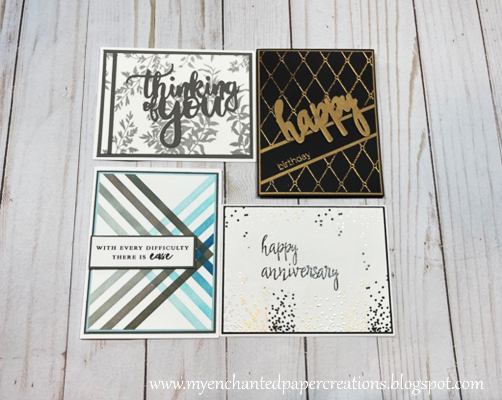


**********************************************************************

Happy Birthday 

Technique: Heat Embossing and Die Cutting

Colours: Black and Gold


I started with a piece of A2 sized black card stock (cs).  I put a piece of painter’s tape toward the bottom.  I dusted the cs with an antistatic powder.  I put the taped cs in my misty stamp tool (just in case I had to restamp the image).  I used a Versa Mark embossing pad on Altenew’s Patten Play-Diamond stamp set.  Over a large sheet of scrap paper, I applied the gold embossing power and tapped of the excess.  I pre-heat my heat tool and warmed the back of the cs, then moved to the front to melt the powered, so there was little to no warping of my cardstock.  I removed the painter’s tape and wiped the card front with a dry cloth to remove the rest of the antistatic powder.  I cut 2 strips of the gold cs at 1/8” and laid them along the top and bottom edges of where the painter’s tape was.   I used wet (liquid) glue to adhere them to the card and clipped the ends to be flush with the cs.  Tape runner will not hold well on the embossing areas and the strips were too small for double sized tape.  I used the Altenew’s Halftone Happy die for my main sentiment.  I cut the happy out a total of 4 times, 1x in the gold metallic cs, and 3 times in the black cs.   I adhered all the pieces together and set them aside to dry.  While the “happy” was drying.  I embossed birthday on the card front in gold.  Then added the “happy”.


Thinking of You

Technique: Die Cutting, Beyond Basic Backgrounds, With a Twist (using washi tape)

Colours: Gray and White


This card was really simple and quick.  I took a 3 ¾” x 5” sized piece of white cardstock (cs) and covered it with Altenew’s Marsh Land washitape.  I cut out a 1/8 strip of the gray card stock and adhered it to the left side of the card front about ¼” from the edge with wet glue.  I sat it aside for few minutes to dry, then I trimmed the gray strip down, so that the strip was flush with bottom and top of the card front.   I used Altenew’s Thinking of You die as my focal point.  I cut it out three times, once in the gray cs and twice in the white cs.  I glued the two white die cuts together, then I off centered the gray (top) Thinking of You just slightly to create a shadow look and glued it to the other piece.   I added a gray mat to the card front.  I centered the “Thinking of You in the space between the gray strip on the left and the gray strip showing on the right side of the card front.  I adhere the card front to an A2 card based and that was it.


Encouragement card

Technique: Stenciling, Inking

Colours: Blue and Gray


I love geometric shapes from masculine cards.  For this card I used Altenew’s Mighty Corners Stencils as well as the Cool Summer Nights and Warm Gray Crisp Dye Ink Cubes.  I started with a 6x6 piece of CS because I was not sure of the final dimension of the card.  And it also the size of the stencil, so I would be sure to capture all the image.   I only wanted enough of the image to use all 4 colours of the inks I chose.  I chose blue and gray for this one as tribute to my favorite artist BTS (South Koreanboy band)-yep…I am ARMY (lol).   I started on one side of the CS and then flip the stencil to the opposite direction to overlap the colours.   Tip (1): The line parts of the stencil are very delicate, so to make sure my lines remained straight and sharp I used a TEMPORARY spray adhesive to hold the stencil in place.  As soon I was done with the stencil, I put it in some warm soapy water.  Tip (2): I used Post-it notes to cover the parts of the card stock (cs) that were inked before moving on to the next colour, in order to keep my colours from mixing.  Once I finished the stenciling, I trimmed the card front down to my desired size.  I double matted the card front with blue and gray cs and adhere the combined card front to an A2 card base.  The sentiment comes from Altenew’s Remember This stamp set.  It is stamped with their Obsidian Black Pigment Ink.  I trimmed the sentiment down and backed it with some of the left-over gray CS and applied it directly to the card front.  


Anniversary

Technique: Heat Embossing, Polychromatic

Colours: Black, Gray, and Metallic Gold, Silver, and Bronze


This card was a little challenging.  Not because it is hard but, it was more my supplies did not want to cooperate…lol.   I used Altenew’s Kind Confetti stamp set to create a celebration feel.  This really is a great stamp set.  I have used it several times.  I have definitely gotten my money worth out of it! 

I started with an A2 piece of cs.  I used Altenew’s Painted Poppy stamp set and embossed my sentiment where I wanted it first.  I used glossy black embossing powder as opposed to mat black embossing powder because I want to give the card a party feel.  I took a piece of Post-it notes and cut it down to cover the sentiment while I was embossing.  I dusted the entire card front with anti-static powder.  Tip (1): Do this every time you are going to emboss the image.  I started just off the edge of the card front, first stamping the image with Versa Mark, then applying the embossing powered.  Tip (2): It is also important to clean the stamp after each use.  It was a little time consuming and I had to start over 3 times before I got one that I was OK with (“Ok with” not thrilled with…lol).  I alternated 5 different colours of embossing powders; however, I have done a card using this stamp set and 2 colours of embossing powder and it was just as pretty.  I did the bottom of the card front first, then turned it upside down and added just the top part the image at the top (the bottom of the image has more concentration of the confetti dots).  I trimmed the card front down to the size I wanted.   Unfortunately, no matter how careful I tried to be, the powder did not cooperate as much as I would have liked.   At the very end, although I thought I got it all embossed, the sentiment had areas where the powder did not melt, and it smeared.  I used an erase tool and got off what I could.  I mounted it on some black cs and then on to an A2 card base.  Overall, I really do like the look. 


 ********************************************************************** 

Altered Item: ALTENEW Flag Banner


For the second part of the challenge, I wanted to pay a tribute to Altenew.  This project ends up serving two purposes.  One is the tribute to Altenew and the second is something to hang-up when I give a workshop!   

I had the flag banner in my craft lab for some time and would frequently come across them and ask myself now what was the plan for those again???  Well, the plan eventually came to me and it turned our perfect (at least how I anticipated).


Here’s what I did to create my banner flags

I painted both sides of each flag with two coats of white acrylic paint.  I let it sit for a least a day to see how well the two coats covered the flags and if I needed a third coat.  Two coats worked fine.  I then covered both sides with Altenew’s Floral FlurriesWashi Tape (To be on the safe side I purchased two rolls of the washi tape).  For the total banner I only used a half of one roll of the washi tape, this included some wasted tape, (I covered seven flags 5” x 7” each).  Before I covered each side of the flag with washi tape, I added a light coat of Mod-Podge (matte) for extra hold (optional).  I used a rubber brayer to remove any air bubbles.  After the flags with covered with the washi tape, I sat them under some heavy books for a day to keep them flat.  The next step was to trim off any extra washi tape and lightly sand down the edges until smooth.  To sand the flags, I used a polar bar and medium file from the beauty supply store.  The flags are about 1/8 thickness, so you don’t want to use heavy sanding, otherwise you will remove too much of the washi tape and the acrylic paint.  The polar bar and medium file are gentle enough for hands, so they were perfect for the somewhat delicate wood flags.  To sand the banner string holes, I used a precision file set. 

Make sure whatever washi you use, it is wide enough and long enough to cover the object.  My flags were painted and dried first.  I added a light coat of Mod-Podge Matte to each side before covering with the washi tape


Putting washi tape on the flags
Covering the back of the flag


Here I am showing what the flags look like once they were trimmed and sanded and the beginning of the decorating process.


Decorating the flags

I am a simple, less is more type of crafter.  I don’t like to journal much, so I pick cardstock, pictures, and other embellishments that speak for themselves; I just have to know how to put them together.  I absolutely love this washi tape and wanted to make sure my embellishments did not overpower it.  I also wanted to pull out some of the rich colour of the flowers.  It’s a banner so it had to have some celebration feel (without too much glitter of course…not a glitter girl at all!).   I used some smooth glitter cardstock and cut out the rosettes on my Cricut Maker.

I sized them to 1.75” x 9.75” for the 5” x 7” flags.  I cut two for each flag for a total of 14 (2 strips make one rosette).   For the lettering I used Cricut font Plantin School Book (multilayer).  I hot glued the rosettes to the flags and used glue dots to adhere the letters to the rosettes.  I made some white tool pom-poms tied with celebrations ribbon.  I curled the ends of the celebration ribbon and my project was complete.

The entire project could have been completed in about two weeks but, because of my busy schedule I took the entire month.  I’m glad I did because I was really able to enjoy the challenge and I really love my end results.   

Thank you for stopping by and allowing me to share my love crafting and Altenew products and ideas.  If you are interested in becoming a certified Altenew Educator, learning more about card making and other great craft ideas and products; click here


***********************************************************************

TUTORIAL

Here is a picture tutorial for a different version of the "Thinking of You" card.  This one is You are Loved.

Supplies: Card based A2 size, cs (card front 3 3/4 x 5 and mat 4 x 5 1/4),  strip cs 1/8 wide, washi tape wide enough to cover card front, liquid and double sided tape (optional), die, 3 die cut pieces, sharps, bone folder, craft pick (optional)

Cover one side of the card front with the washi tape

Trim off excess washi tape

Miter the corners.  This will help with folding the washi and decrease bulk on the back; helping the card to lay flat.

Fold the the remaining washi tape on to the back of the card front.

Turn the card front so the design side is facing you. Add the 1/8 strip of cs to the left side of the card front about 1/4 from the left side.  Adhere the strip with liquid glue.

Clip  the strip on the ends so that the strip is flush with the top and bottom of the card front.

If you are using double sided adhesive, apply it to the back side of both the card front and the mat

Die cut the sentiment/greeting out 3 times, once in the coloured cs and twice in the white.  Adhere the two white die cut together with liquid glue so that all sides are flush.  Then you will add the coloured cs BUT off center the coloured cs just slightly to create a shadow affect.

When you have the completed the above step, your die cut should look something like this.

Center the sentiment/greeting between the strip on the left side and the gray border on the right.  It is best to use a liquid glue to secure the die cut on the washi because of the (slick) surface of the washi. 

Add the card front/mat to the card base and you are done!


Thank you for taking the time to visit me again. And until next time, stay safe, Joyce.


Related Posts Plugin for WordPress, Blogger...