Showing posts with label Distress Inks. Show all posts

Monday, January 20, 2020

For The Guys

A Big Texas Hello!

Today’s card is out of this world!  I don’t know about you but most often my cards are more on the feminine side.  The For The Guys class over at Altenew.com gave us good ideas and inspiration for making masculine cards.   I did a card like the one demonstrated for the class.   What I learned was I don’t have to be so careful and calculated with inked back grounds all the time and still come out with amazing end results.

This card starts off with an A2 piece of white card stock as the card front.  I liked the inked results so much, I used the entire panel, so the final card size is a little larger than a A2.  I used a couple different shades of blue dye inks and some black ink to create my background.  I started by using the lightest blue ink all over my card front.  I added the darker blue ink starting at the edge and about halfway in toward the center blending the two as I went along.  I did this in random places on the card front.  I did not blend the entire card front.  I wanted the blues to blend in some places and keep their individual colour in random spots.  I added the black in around the edges of the card a little heavy and very lightly moved toward the center just covering the blues.  I used my spray bottle to add some water droplets on to the inked background.  Then I took a piece of folded paper towel and pressed down on my background.  This created the faded-out droplet appearance on the card front.  Next, I took a drop of white acrylic paint and a couple drops of water and mixed them together to make a thinned out white liquid.  I used my Tim Holtz splatter brush to splatter the thinned liquid all over the background.  I’m not sure if you can see it but some of the spots have tails which look like comets or shooting stars.  I let the background dry completely.
On some white cardstock, I used first generation stamping with Altenew’s Mini Moon Stamp Set and their crisp dye ink cubes Citrus Burst and Silver Stone to create my moon.  I die cut the moon using the Mini Moon matching die.   Before I attached the moon to the card front, I heat embossed the sentiment from the stamp set on the card front with Versa Mark and white fine detail embossing powder.   I did a little extra on this card by carrying the theme over to the inside bottom of the card.   
For more information on Altenew products, inspiration, and classes click HERE


Altenew Products:


Joyce

Wednesday, November 20, 2019

The 25 Days of Christmas Tags 2019- Day 17


Welcome back my friends.  I hope everyone had a pleasant day or perhaps your day is just starting, and it too will be a pleasant one.   Today is day 17 of Tracey McNeely’s 25 Days of Christmas Tags.  This train is really moving along, can you believe we are on day 17?! (and I’m still hanging in there).  I know…right!  Well, today the sponsor is Pretty Pink Posh, another goody.  My tag(s) are inspired by two of Pretty Pink Posh’s designers- Jeanne Jachna and Caly Person.  Click on their names to see their precious tags.  I was so inspired; I did three tags.  Well, one tag design, three different colours.   


Here is what I used to make my tags: Recollections (Michaels brand) #65 white cardstock, Avery Elle’s Postage Stamp Dies, Tim Holtz (Sizzix) Christmas Circle Words, Disney Frozen A6 Stamp (Tuesday Morning purchase), Altenew Crisp Dye Inks-Morning Frost and Limestone, and I also did one tag using Tim Holtz Distress Ink-Antique Linen and I added some 1/8” Satin White ribbon to complete the tags.   Now how easy was that?   Thank you so much for coming by to see me today and I hope to see you again tomorrow.   


Joyce

Thursday, November 14, 2019

The 25 Days of Christmas Tags 2019- Day 11


Hey everybody, it’s late here in Texas and I need to get to bed asap.  So here it goes...  This is day 11 of The 25 Days of Christmas Tags.  You can find Tracey McNeely’s information here

Today’s sponsor is Studio Katia and my inspiration came from Laura Volpes’ one layer alcohol inked gift tag.  You can find her tag here

Things I used to make my tag- Recollections white cardstock, Distress Inks (Black Soot, Chipped Sapphire, Tumbled Glass, and Broke China), Momma Elephant stamp and die set, Momma Elephant dies Ocean Waves, Clear Star Jelly Roll pen, Sharpie Markers, Copic Markers, Just Rite Clear Christmas Mini Tags stamp set, Versa Mark, white embossing, Maya Road Clear Shimmer spray, and watered down white acrylic paint.   Well, gotta go...See y’all tomorrow. 

Joyce

Wednesday, January 31, 2018

St. Valentine's Day Shaker Tag


Hello Everyone,

It is the first challenge of 2018 at Eclectic Ellapu.  This month’s challenge is “Anything Goes”.   This month has a lot inspiration such as St. Valentine’s Day, Mardi Gras, Lent, the Olympics, Black History Month, the Superbowl and so on.  For my project I chose to make a St. Valentine’s Day Shaker Tag.   I used some Kraft, Red, Pink, Black, and White cardstock.  The Pink, Red, and White cardstock are from Stampin’ UP!   The black cardstock is from Michael’s Recollection, and the Kraft is from Hobby Lobby Paper Studios.  I used some red and white Baker’s Twine, some glitter cardstock from JoAnn’s, acetate sheets from Michael’s, some black foam tape, Spellbinder’s ATC Die D-Lites, Tim Holtz Side Kick and the Side Order that comes with the machine.  I inked the edges with Tim Holtz Distress Inks-Antique Linen, Vintage Photo, and touch of Walnut Stain.  I filled the tag with little hearts cut from my Momenta heart die.    Can’t wait to see what you create this month!  
 
 
close up of the little hearts
 Joyce
 

Sunday, December 10, 2017

Let It Snow Christmas Card


Hello Everyone,

Here is a quick Christmas Card.  You know it’s quick if I can complete 2 Christmas Cards in one day…lol.   This is an A2 sized card (4 ¼” x 5 ½”), made with #110 card stock for the base.  All borders are ¼ “.  I used black card stock for the mat and the focal point is a scrap piece of #110 card stock.  The back ground is made by using painters tape to cover all 4 sides and Tim Holtz Distress Inks-Blueprint Sketch and Broken China.  The greeting, sentiment, and snowflakes are all made with Just Rite Stamps “Large Fancy Holiday Sentiments”.  I used Tim Holtz Distress Ink Weathered Wood and Memento London Fog to stamp the snowflakes.  The tree stamp is from Stampin’ UP! “Lovely As A Tree stamp set.  The Greeting is stamped on 65# paper; using and I used some very old Stampin’ UP! Movers & Shapers Label die and the matching hand punch. I kept the inside very, very simple with only the sentiment.  I made a matching envelope with a few random snowflakes stamped on the front and back.  I think I saw this card on YouTube; however, I forgot to write this one down, my apologies.  


 Joyce

Stained Glass Stamping Christmas Card


Happy Holidays everyone,
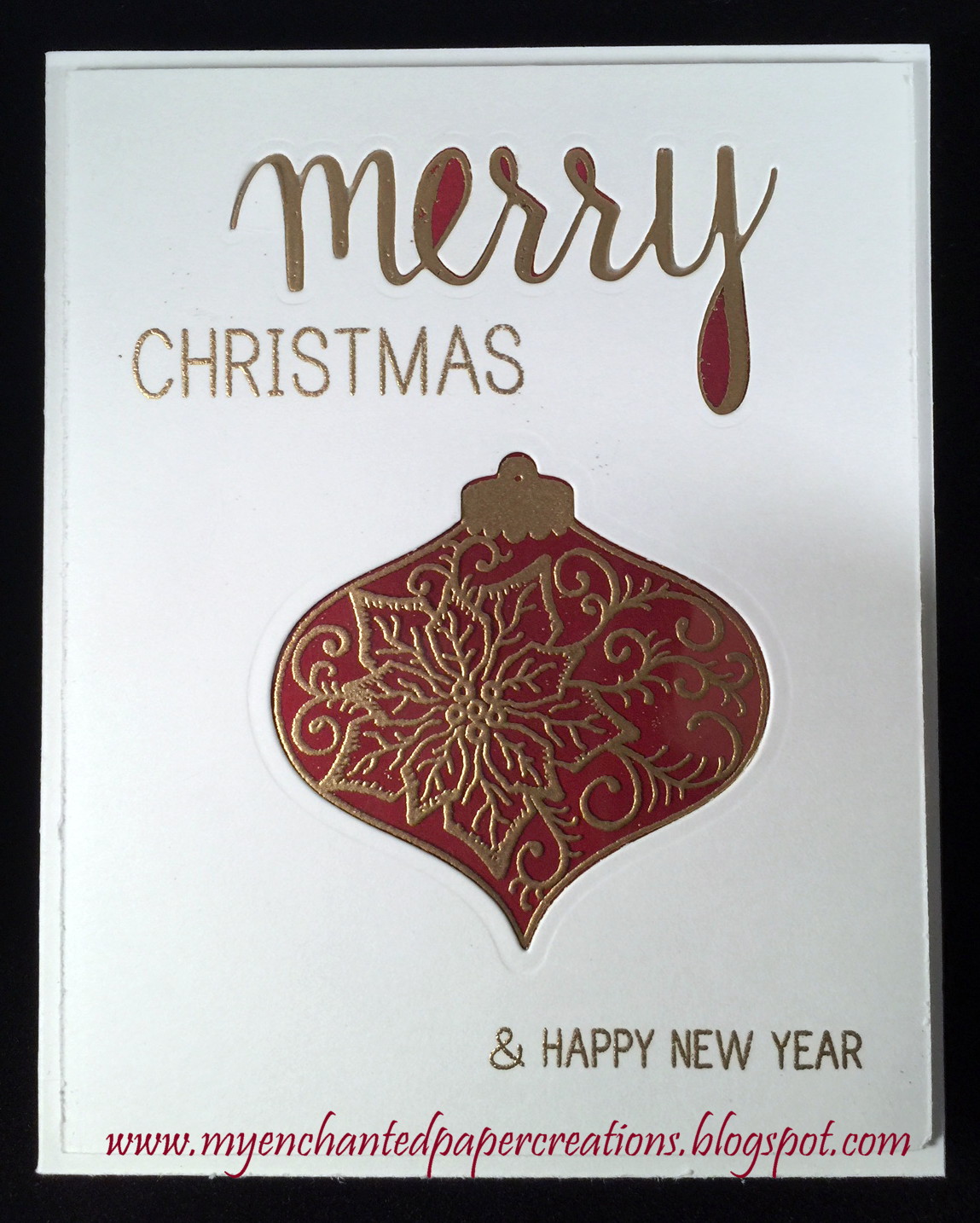
Here is a Christmas card I made using a technique called Stained Glass Stamping.  You can find the video on Jennifer’s YouTube channel here.  Jen used some fall stamps for her card.  As you can see, you can use any matching stamp and die set.   The base of my card measures 5 5/8” x 4 ½” and made with 110# cardstock.  I’m not sure what size Jennifer’s card ended up being.  I did not pre-measure my card either, hence the crazy “5 5/8”.   The card front is ¼ inches smaller and popped up for dimension using 2mm fun foam.   The “Merry” is cut using the Hero Arts #DC170 “Merry” stamp and die set. The greeting is from the same stamp and die set.   The Christmas Bauble is cut using Spellbinder’s Heirloom Ornaments 2011 set.  The Image within the bauble die cut is a Heartfelt Creations pre-cut stamp set #3417 “Poinsettia”.  I embossed the image with gold embossing powder on heat resistant acetate.  The colour behind the die cut and stamp is a piece of white card stock that I coloured with distress inks.  I used Tim Holtz’s Festive Berries, Fired Brick, Candied Apple, and Aged Mahogany and then I heat set the colours.  The sentiment inside is from one of my favorite stamp lines Quietfire Design, #5858 “Gentle Thoughts”.   It looks difficult but really it was easy.  The only challenge I could see for anyone is finding some heat resistant acetate locally.    I actually got lucky and found some heat resistant acetate in my stash, that I bought from Judkins at a stamp convention in 2010!!!  I almost forgot to mention the matching envelope.  I made the envelope using my WRMK punch board, some Stampin’ UP! Cherry Cobbler card stock, gold embossing powder and the pre-cut Heartfelt Creations stamp set noted above.  I removed the Versa-Mark from the outline of the stamp, then stamped and embossed the inside image on the flap of the envelope.  Well folks that’s it for today.  I hope you’ll give it try.


Joyce

Saturday, September 30, 2017

Dreamweaver Dark and Dramatic


Hello crafters,

My favorite time of the year is nearly upon us…FALL.  This month’s challenge theme at EclecticEllapu starts the season off with Dark/Dramatic Colours and/or something Scary.   My project is a dark dramatic and somewhat scary looking card. I didn’t want to do a the usual Halloween card.  I went to Pinterest for some ideas.  I got the idea for this card from Susan H.  I followed the link to Susan’s blog which is My Mindful Creations that link should take you directly to the post for this card, it’s dated October 5, 2012.  I changed up a few things on the card but her card truly inspired me, thank you Susan!  
The supplies I used for my card:  Grey cardstock I had in my stash for a long time.  It was from The Paper Company, the colour is charcoal.  Black cardstock- Michael’s Recollection brand, Strathmore 140lb Cold Press Watercolor paper, Tim Holtz (TH) Oxide Distress Inks Black Soot and Iced Spruce, TH Distress Ink Black Soot, Hickory Smoke, and Squeezed Lemonade, Momento Tuxedo Black Ink, TH Distress Spray bottle to add a little water, my heat tool, Spellbinders Die D-Lite “Hello”, Spellbinders Resplendent Rectangles, 3 black flat back pearls, and I created the sentiment on my computer using font-Chiller a size of 26.   I really like how it turned out.   Please join us at Eclectic Ellapu, I can’t wait to be inspired by what you create!!   Check out the photos below. 

 
This is really dark, I tried to enlarge the image so you can read the sentiment which says: "Bat you didn't know I was thinking about you?!"


Here is a close up of the greeting.  I added dimension by cutting the greeting x2 in black and x1 in the charcoal cardstock, then I glued them all together but I offset the charcoal just bit.


Well, I'm off on another crafting adventure, let's see where my mind takes me...til' next time,
 
Joyce


Friday, July 1, 2016

Message in a Bottle

Hello my peeps!
It's that time again.  You got it, it's time for another awesome bragging-rites challenge over at Eclectic Ellapu.  This months' themes are the "Anything Goes" and the "Beach".  I have to say, I wasn't paying attention very well last month because I did a beach card for last month's challenge for my "summer" theme...duh!!!  Well, when I realized the error of my ways, I had to come up with something really good for this month.   First, I decided that I would do something dimensional.  I'd been eyeing some things on Pinterest and YouTube for a couple weeks and I came up with an idea for altered bottle project.  Since this was my first attempt at altering a glass bottle, I thought I'd better start small (lol).  And let me just say, I'm glad I did.  It was a lot of fun creating my project but it was time consuming and it was messy!  My warning to anyone-if you are an instant gratification type crafter...step away from the altered bottles...  My goal was to make the bottle look very old, tarnished, and rustic, like it might have washed up on the "beach" from far away.   I really like how it turned out.  

Okay, now for the supplies I used...I started out with a very nice neat list of stuff that I used as I was going along, but some how it got lost in all the mess of my craftroom when I was creating the project (Some where between the workstation, craft table, and my desk).  And before you know it, I'd forgotten that I stopped writing things on the list (urrrrh)!   Sadly, this happens to me a lot (lol).  When I'm in my craftroom, my mind just goesssssssss.  I might start out in one direction and totally end up somewhere else.  I just grab stuff and see how it suits the project I'm creating at that moment and if I think it adds to where my mind is at that time, then it's in the project (lol).  With that being said, I am going to try my best to tell you what I used to create this little bottle.  

The bottle was a clear glass bottle from Hobby Lobby ($1.99).  Originally, I used to Krylon Metalic Gold spray paint and covered it but I didn't like how it turned out.  I then decided to layer on some texture by using mesh, and some metal embellishments, and some flowers.  I put on 2  coats of Gesso.  After the Gesso was dry (I let it sit overnight).  Then, I took my hot glue gun and added the lines and Xs.  I wanted the colours to be a blue-green for a patina effect. Alllll-righty! we're cooking now folks... I started out using some Tattered Angels sprays; however, they were too light and too shimmery.  I needed something that was going to give a deeper richer colour.  I used Tim Holtz distress stains peeled paint and broken china applied them with a sponge.  I used some Baroque Art Guilder's Paste (German Silver) and Perfect Paints-Shimmering Matte Acrylics (#1008 Bright Gold), then dusted the bottle with Tim Holtz Distress Ink-Vintage Photo. It took some doing and quite a bit of trial and error but I got to where I was trying go finally.   The other supplies used in my scenery are sea shells, sand, and netting from Hobby Lobby and some autumn coloured pearls from JoAnn's.  I made a little message in the bottle.  My inspiration came from one of my favorite movies called "Message in a Bottle" with Kevin Costner (that man is still fine as ever)!!  Took some patterned paper that I had in my stash, inked with Distress Inks: Vintage Photo, Walnut Stain, and Antique Linen, used Stampin' UP! En François back ground stamp, distressed and tattered the edges and stuck down in the bottle.  Well, that's the scoop... Until next time... I hope to see in our June challenge at Eclectic Ellapu; good luck!


Of course you know there has always got to be a fleur-de-lys somewhere on my project (lol).


Monday, February 8, 2016

Mardi Gras French Country Initials

Bonjour mon amis!  It's one of my favorite times of the year.  Mardi Gras season and Easter!!!  Love oh love me some Easter.  It seems everything old is new again, the tulips and daffodils bloom, and the trees begin to bud, it's just wonderful.  You can't help but to smile knowing the reason for the changes...Jesus of course!  I am so inspired by these events and the fact that I need to get some projects done, that I did some initials. And what better paper to do them with but...Graphic 45's French Country!  Talk about needing Jesus, I'm really going to need a double helping of Jesus when my French Country paper stash is done.  Since it's no longer in print, I've been making everything I can think of with the paper; so whenever I look around my craft studio and my house I will always see it.

As stated above the letters are covered with Graphic 45's  French Country Collection,  I used #4500638 "Montage" and on the back; I kept it plain and covered the letters with Graphic 45's An ABC Primer Collection #4500384 "Calico Kids".  A couple of the wonderful qualities about Graphic 45 paper is that you can mix and match styles and colour.  The Letters were a very light coloured wood.  I purchased them from JoAnn Fabric.  I love these chunky letters because the bottoms are shaved flat, no need for adding a base (unless you want to). When you sand the paper edges on them, you don't destroy the letter trying to get your paper flush with the edges.  I use stain on my letters instead of acrylic paint, it gives a more natural and polished look. For these letters, I used Tim Holtz distress stain Vintage Photo.  I used his distress ink to do the edges of the paper after I sanded it flush on to the letters (I used Mod-Podge to adhere the paper to the letters).  I don't like to cover up too much of the patterned paper, so I used minimal embellishments.  Sometimes less is better.  I used some wooden flourishes that I picked up at Michael's, the pearls are from JoAnn's in the bead isle.  They come in a small pack with pearlized Autumn colours like chocolate, sienna, forrest green, light green, tan, and terra cotta.  The Mardi Gras mask charms I got from Hobby Lobby.  They were silver, so I applied some gold Rub-n-Buff to bring them in-line with the colour scheme I wanted.  The feathers are from JoAnn's and the flowers are from two different Prima collections, I  picked those up at Hobby Lobby. All of the supplies I had in my craft studio for quite a while, I took something old and made something new.  I made the wooden embellishments at the bottom of the letters by covered up some wood chips with some 6x6 French Country paper pad scraps. Since they were so tiny, I just used my Tombo Mono liquid glue to adhere the paper to the wood chips, sanded the edges,  and inked them with Vintage Photo and viola! instant matching wooden embellishments.

I love how the letters came out, they look great on my shelf.   I was looking around for a challenge to enter and I found one at Altered Eclectics, this is a challenge blog run by Ellapu.  It's really nice because it's only for altered art and mixed media, NO cards, ATCs or the like.  The challenge runs until the end of the month, so you have plenty of time to join the fun.  I love altering things so this was right up my alley.   Thanks for stopping by, enjoy the pictures, and I hope to see you in the challenge!  Til' next time, Your Grace the Duchess (Joyce).
Laissez le bon temps rouler!
Heureux de mardi gras!


(back)

Related Posts Plugin for WordPress, Blogger...